Creating better design experiences with component libraries

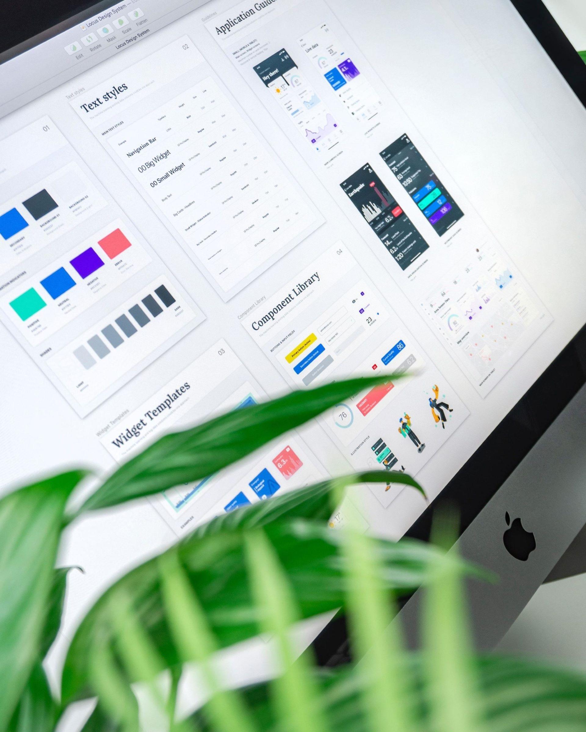
Design systems help us build sites where all parts serve their purpose and create a fluent, meaningful experience. Start building a design system as early on in the project as possible.
Component libraries may sound like a trendy word but foundations for this kind of thinking has been around for as long as people have been creating things. Egyptians had clear rules on how things should look painted, ancient civilisations can be identified by their tools and ornaments, and different architectural styles all have their characteristic elements. In 1977 a famous book called "Pattern Language" introduced an illustrated architectural pattern system that can be considered the first-ever documented design element or component library.
Nowadays we build online services and the idea of design systems is as important as ever. Just like a building consists of hundreds of parts, a website consists of hundreds of components that each have their own purpose. You may have noticed that on some sites the components work well together and their purpose is clear. On some sites - not so much… Component libraries help us build sites where all parts serve their purpose and create a fluent, meaningful experience.
Component libraries enabling effective development
The idea of a component or pattern library is to document all parts that form the site’s or service’s interface. Just like any development work, building such a system is an iterative process. Some parts will be removed, some need to be added and existing ones need to evolve. But having your system documented makes this work easier and reduces the risk of creating duplicates or losing something valuable.
There are different ways of building, categorising and documenting a component library, and the main thing is to find a way that works for your team. Whichever approach you choose, the system usually covers all functional and perceptual patterns that form the interface. Their attributes are described in a way that is directly usable for developers. This saves valuable time and resources in the development phase.
But a good system is also much more than a catalogue of patterns. It increases the team’s understanding of the service they are building and creates a shared language that enforces the project’s goals and principles throughout the development.
Functional patterns – the building blocks
Some call them modules, some call them elements - functional patterns are the site’s building blocks like buttons, lift-ups and progress bars. They make the interface tangible and help the user accomplish a certain goal. These patterns can be split into smaller parts, eg. a lift-up could be split to image, header and link. A link consists of colour, font and animation. This is a good example of the atomic design principle where smaller building block, atoms, are combined to bigger particles and so on.

Perceptual patterns – the look and feel
Perceptual patterns are patterns that form the site’s look and feel. They include the use of colour, space, animation, typography and iconography. They play a big part in creating a quality experience where visual attributes guide users towards their goals. In other words, your site will have colour, typography, etc. anyway. Whether they are what you intended and help achieve the goals you’ve set, depends on how well they were designed and implemented.

Start building your component library early
Together functional and perceptual patterns form the experience of a website. On bigger sites, there could be dozens of patterns but the component library help us keep the experience consistent and manageable. It also makes it easier to expand an existing site and share knowledge when the project team grows. With all the benefits in mind, it makes sense to start documenting your design and development patterns as early on in the project as possible.
Wish to discuss in more detail with our expert?
Send Talvikki a message or fill in the form and let us contact you!
